Tool
Mobile-friendly test
Updated Oct 9, 2026
Screen sizes shows your page at a phone's, a tablet's and a laptop's width, side by side.
10 free checks a day
Try it on our sample website.
Your page at three sizes
People with weaker eyesight often zoom in to 200% or more. Then a laptop gives your page half the width and draws everything twice as big. Nothing should be cut off, overlap or make you scroll sideways (WCAG 1.4.4 and 1.4.10, the accessibility rules on zooming in).
These are your own browser at each width, which catches most layout problems. A real iPhone's Safari can differ in small ways: see See your site on a phone.
What you'll get
Mobile-friendly means easy to read and use on a small screen. Scroll inside each preview to see the rest of the page.
After the first three, you can switch to:
- Six common sizes: a small phone (360 pixels wide), a big phone (430), a tablet upright (768) and sideways (1024), a laptop (1366) and a wide desktop (1920).
- Rotate on any phone or tablet, to turn it sideways.
- 200% zoom: your page on a laptop as someone who zooms in sees it, beside the normal view.
Here's Wrenfield, our test town. On the phone, the menu wraps onto three lines and pushes the page down; on the tablet and laptop, it fits on one.
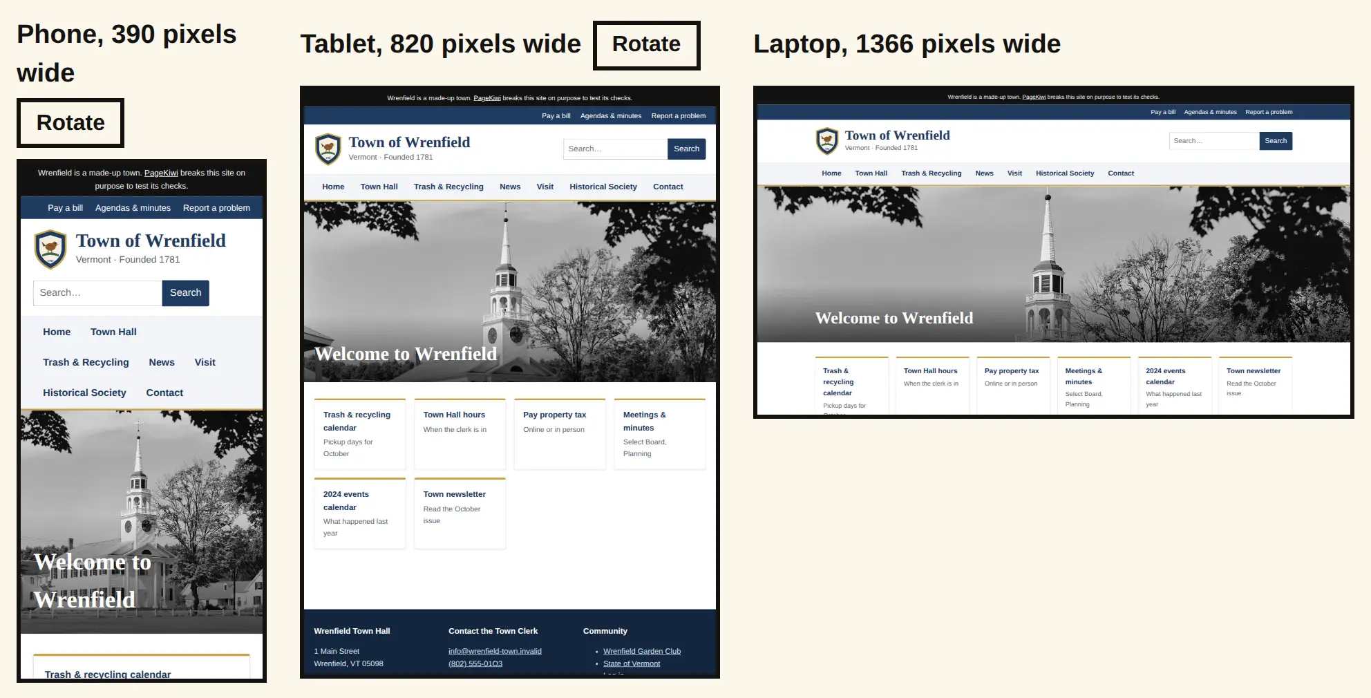
Try it on Wrenfield, a sample website we break on purpose.
It doesn't give your page a score: you look, and you judge. Google used to offer a Mobile-Friendly Test, but retired it in December 2023.
Some websites ask browsers not to show them inside another site, a sensible security setting. We check that first, and if yours does, we say so before showing anything and point you to your browser's own phone view.
Many people with weaker eyesight zoom in, which makes your page behave like a narrower screen: if it works on a phone, it's likelier to work zoomed in. Website accessibility: where to start, with the tools that help and what the law asks.
How to use it
- Type your page's address and press Show it. You see it on a phone, a tablet and a laptop.
- Scroll inside each frame. Look for text cut off, things overlapping, or a page that scrolls sideways on the phone.
- Press Rotate under a phone or tablet to turn it sideways.
- Pick Six common sizes for small and big phones, a tablet both ways, a laptop and a wide desktop, or 200% zoom to see the page as someone who zooms in does. Switching doesn't use up a check.
- If a frame stays blank, the site doesn't allow being shown inside another page. That's a setting, not a fault. Try See your site on a phone instead.
What your results mean
- Pixels wide
- How much room the browser gives your page. Phones are about 360 to 430, tablets 768 to 1024, laptops about 1366, big desktop screens 1920.
- Turned sideways
- The same device on its side: wider and shorter, so a menu may fit on one line but less fits on the screen.
- 200% zoom
- A laptop zoomed in gives your page half the width and draws it twice as big. If everything still fits the width and nothing is cut off or overlapping, the page copes with zooming in.
- Scrolls sideways
- Something is wider than the screen, often a table, a big photo or an embedded map. Visitors have to drag to read it.
When to use it
- Before you launch or redesign.
- After you change your theme or template.
- After you add a wide table, a big photo or a new menu item.
- Someone says your site looks wrong on their phone.
Why it matters
- Many of your visitors will only ever see your site on a phone.
- Text cut off, or a page that scrolls sideways, makes people pinch and drag, and plenty give up.
- A menu that wraps onto three lines pushes what people came for out of sight.
Go deeper: Squarespace or Wix mobile view looks bad? Cropped banners, tiny or overlapping text, missing sections, or the desktop version on phones, and the editor setting that fixes each.